Wednesday, September 23, 2009

Since summer school I have done very little, partly as we had the wettest summer for a century here and it made havest long, difficult and unprofitable! We only finished cutting the last of the wheat in mid september - at least 3 weeks later that usual.
I am moving on to Chapter 12 of module 1 - Towards an embroidered item and using some of the shapes etc from summer school.
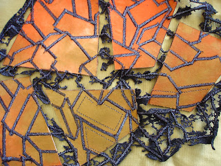
For the sample above I cut up a piece of covered vilene into shapes relating to my stacked boxes, cut out the same shaped holes in meltable felt and then stitched the whole lot with stacked box lines. Then I zapped it.

Strips of stitched boxes and cut out box shapes in layers colours.
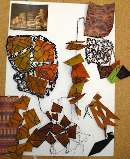


I had thought of making an enoromous lampshade as I need on in the house but am not sure if it would be a fire hazard! I may just stick with a bag!

Saturday, June 27, 2009

I made a book using my stacked box shapes and two contrasting colours from my colour scheme. I wanted to look and light and dark, shadows and lit shapes.

The pages are alternately light and dark two page spreads and so the book looks very different depending on which set of pages are most opened.


Thursday, June 25, 2009

1.9.1

1.9.2
I have been having a go at chapter 9 - explore with abstracted fragments - and have ended up with this rather mad sixties wallpaper! Not a pretty sight. I shall have to start again with another starting point or try a different design option!

Monday, June 15, 2009

1.6.3
I have had another go at dyeing a range of browns as I wasn't very happy with the last lot. Brown, I discover, is a difficult colour and can look as boring and dead as possible. I dyed this lot with golden yellow, brilliant orange, cobalt blue and some turquiose and overdyed the whole lot with brilliant orange afterwards to give them a bit more zip.

Sunday, June 14, 2009

Can anyone tell me why some photos enlarge when clicked on and others don't? This is a pain as not all my photos are that clear and I would like Sian to be able to enlarge them.


1.11.1
1.11.2
1.11.3


1.11.4
These sheets are work for chapter 11 of module 1, Bold Design Development.
The marks were made using potassium permanganate on a toothbrush onto black quink
ink and black quink with some procion dyes added. The potassium permanganate reacted with the inks and produced a lovely range of colours. I also tried it on orange procion dyes used as an ink but the result was not as good.
I took the marks made into photoshop and had a play with them and quite like some of the results. The bottom left one of 1.11 3 looks like a snakes and ladders board!
1. x


1.y
These two sheets are some design work done using the elements of line, shape, colour etc as a starting point and amalgamating the best little tiles into a new idea.

Wednesday, June 3, 2009


I have not got a lot done this month, although I have been getting used to my new sewing machine and finishing a piece for an exhibition with the Cork Textiles Network.


1.6


I have been dyeing fabrics and gathering up the work on colour samples - I am using an A2 portfolio to mount them.

1.7.1

1.7.2 this is very zappy felt and gesso - done in a workshop with Maggie Grey in Dublin which was brilliant fun.

1.7.3


1.7.4

1.7.5


I have started work on the design chapters and have looked at Line, Texture, Shape and colour in different elements of my painting. I have made little card studies of each and then selected what I think are the three I will go on to look at. The next stage is to combine all or 2 of these elements and see if a design emerges. This is not the approach in the module but I am going to try it before starting work on the suggested options.


1.8.1

Thursday, April 30, 2009

1.7.1

1.7.2
1.7.3


1.7.4


I have started on a couple of stitched samples, although I have got very little done this month. However I set myself to post at least once a month and that only leaves today for April.

One of the reasons for the lack of progress is that I "gronked" my machine (my term, not the repair man's!) and I found very little got done with out it. I am no longer much of a hand stitcher I am afraid.

Although my machine is now fixed and fine I have bought a new all singing all dancing machine - it took much discussion and agonising but to hell with the credit crunch! there are some advantages to being 50!
1.6.1 I chose to work with cold water dyes as I think I will use natural fabrics for my first assessment piece. However I did get hold of some disperse dyes and have a go with them.

Sunday, March 29, 2009

I have a really tiny notebook for visits to galleries etc and for
stray notes.
Still Life with Lemons and Oranges. Melendez

Still Life with Glass and Lemon. Picasso 1910


I went again for a family visit and fitted in a visit to the National Gallery and their exhition on Picasso and his interpretations of other paintings by great masters. It was brilliant, and one of his still life paintings was an interpretation of the sister painting by Melendez to the one that I am using as a theme, and hangs beside it in the National Gallery.


This month I was very lucky and had two trips to London. The first was a day trip with my sister in law. Ryan air makes it cheaper to fly to London for a day trip from Cork than to take a train up to our capital city Dublin, which is plainly daft but there it is. We went to see an exhition of hats at the Victoria and Albert Museum and it was brilliant!


1.2.7 small sketchbook. These pages are based on
piled up and stacked boxes and I have used the pages
as layers to cut into to give the idea of heaps and heaps!

1.2.8 small sketchbook


1.2.9 small sketchbook


Friday, March 20, 2009

1.3.6


1.3.7 these folded paper shapes seem to relate well to the
stacked boxes, with their vertical, horizontal and diagonal lines.
I increased the contrast in the pictures to mirror the high contrast in
painting. I would like to take these into textiles if I could.

1.3.8


1.2.6 These two are a rough sketch, rearranging the elements of the
painting. The top one has placed them in a different triangle
in the centre of the picture and you can see through the image to the one
below. the bottom one has split up the elements over the surface
which makes them look whimsical and the surface of the picture
flat.

1.2.5

Tuesday, March 17, 2009

Happy Saint Patrick's Day from Ireland to all Distant Stitchers!
1.5.6


1.5.5

1.5.4


1.5.3


1.5.2


1.5.1


1.2.5 small sketchbook

1.2.4 small sketchbook
although it is not clear from the above pictures, the 2 images above are made up of 2 pages, one a window with wires across it relating to the shapes from my boxes and an image behind.

1.2.3 small sketchbook . the pictures above and below
investigate the light, mid and dark tones of the painting,
both as sketches made using masking fluid as a resist,
and using photoshop to pick them out.


1.2.2 small sketchbook.


1.2.1 Small sketchbook. using photoshop I looked at
over-emphasising the lighting affects on the surface of the
picture. I amazed me to be able to move the lit area around
the surface of the painting at will! Extreme lights and darks.